

Pairing Furniture and Colour Palettes to Create the Right Ambience in Your Home
Striking a balance in the home can be difficult. We want our rooms to be functional, practical and orderly, but we also want comfortable, stylish and relaxed spaces to unwind and be ourselves. Achieving this requires investing time and effort into decorating the space, which can be challenging when you’re figuring it out on your own. But you know how you want to feel in your home, so it’s time to start designing a space that will meet your goals.
Choosing good quality, bespoke furniture that fits the space well and works with your style is a huge part of this, as is adorning those pieces with the right soft furnishings. But one thing that many people overlook is something that can drastically influence the ambience; the colour palette.
This article will take you through what a colour palette is, why choosing one is an important decision and offer insights on selecting the right one. It will also cover choosing the right furniture to layer on this palette and how you can transform your house into a sanctuary when you get this combination right.
What is a colour palette?
A colour palette or scheme refers to a chosen selection of colours and shades for a design that will flow together to create a certain look or feel. With interior design, selecting the right palette is essential, as the colours we’re surrounded by can influence the atmosphere in a room, and ultimately how we feel
Understanding the emotional impact of different colours is the first step to creating a harmonious living space.
Why choosing one is an important decision
A person’s home is an extension of their personality. It’s where they feel safe and express themselves, so it should be full of colours, shapes, styles and pieces they enjoy. When choosing a palette, there’s no doubt that you’ll be influenced by what colours are in vogue at the moment, but don’t let the opinion of the masses make up your mind. Think about what colours you enjoy and why you want to be surrounded by them; there’s most likely a palette that includes these shades and others that will stimulate the mood you want to create.
Selecting the right palette for your space
Cool tones
Blues and greens are known as cool tones and are recognised for having calming and soothing properties; sea green hues create a sense of serenity, making them ideal for bathrooms and bedrooms where people want to feel calm.
Opting for a palette containing these shades in the bedroom will probably mean that you’ll paint the walls and include soft furnishings such as rugs, cushions or bedspreads in various blues and greens. However, it’s a balance and the importance of not overdoing it can’t be overstated; instead of searching for blue or green furniture, look for pieces in colours that will compliment the cool tones such as chocolate browns, greys or dark timber.
Bedside tables and cabinets like those in the Alaska Collection would pair well with deep blue or mossy green walls, while a grey, upholstered bed such as the Arizona will also fit well with this palette.
Warm tones
Reds, oranges and yellows are warm tones, which will help ignite energy and motivation, making them a good option for rooms such as a dining room where you want to have an upbeat atmosphere and encourage conversation. Deeper reds like crimson, garnet and maroon contribute more to a sense of cosiness and comfort; these could be included in a living room or library palette.
When pairing furniture with these colours in a living room, brown or navy lounge suites in softer fabrics will work well together. Timber coffee tables and TV units in darker shades of wood like ebony or mahogany will compliment a colour palette with darker reds and deep blues or navies; matching both of these pieces will also help to create a sense of flow in the room, so look at collections rather than singular pieces.
Suppose you’re opting for a warm colour palette in your kitchen and dining area, as many do, to create a sense of flow throughout the various rooms. In that case, you can look at different fabrics. Materials that foster a sense of structure and hygiene are a good option, so consider something like these simple grey Mya Dining Chairs in leather, with a wooden table in a deep tone.
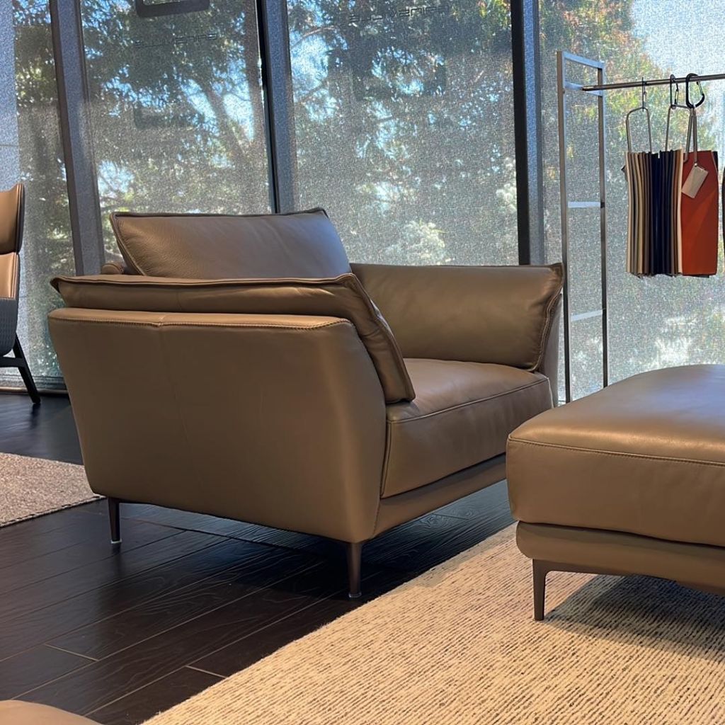
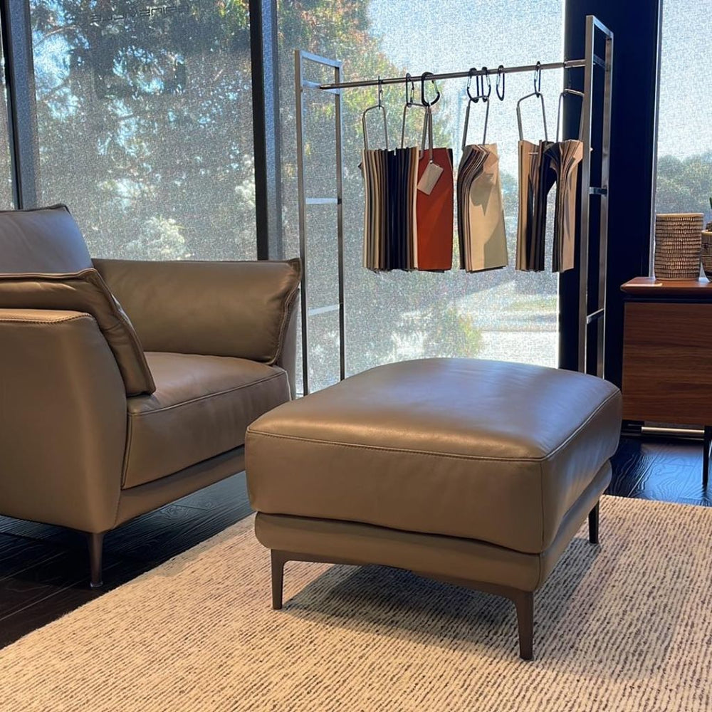
Neutrals
This colour category has become popular over the past ten years due to its ease of the eye and the sense of sophistication, but largely because of its versatility as a blank canvas.
Starting with a neutral base, such as the grey Mason or the Miami sofa, allows you to create various moods by swapping out soft colour furnishings. These pieces work well along white, grey or beige walls, but bringing in a colour somewhere is important to avoid creating an insipid feel.
Whites, creams and beiges show stains and are less fit for long-term wear, so users may feel worried about spills or marks and struggle to relax. The phrase ‘pop of colour’ springs to mind here: drape colourful throws over the back or the arms of the sofas, roll out patterned rugs and hang vibrant art on the walls to introduce a myriad of colours and textures to help people relax.
So, before decorating your home, think about how you want to feel in each room: energised, relaxed or motivated? Consider your colour preferences and if they align with your ambience goals. Once you’ve identified the right palette, you can build on the interior with the right furniture. Once you’ve identified the right palette, you can build on the interior with the right furniture. When you reach this point, visit Gainsville to find the high-quality, bespoke pieces you’ve been looking for. From leather dining chairs to timber coffee and dining tables, our team in Melbourne will work with you to find the pieces that are right for your space.